Introduction to the application
Once you create your account you will be able to access Genialis Expressions. This short introduction will explain what the interface of Genialis Expressions app looks like and how it is structured.
Please note that we recommend you use Chrome browser for best results in Genialis Expressions.

A - Top Bar
The top bar contains information that you can access from anywhere in the app. It is fixed on top of the screen which means it always stays in the same place even if you scroll the page.
From here you can:
 See the status of all processes currently running on Expressions front-end in
the Background Tasks list
See the status of all processes currently running on Expressions front-end in
the Background Tasks list
 Export and download the data from the app
 Get bookmark URLs for sharing
 Access help pages
 Access your account information (Edit profile, Sign out)
C - Pages
Each page represents a rounded group of tasks that the user performs on the app. Genialis Expressions app consists of the following pages:
 The Search page is the landing page after logging into Genialis Expressions
where you can search and view data that has already been imported. Here you can
select collections and samples to explore them further in the Visualizations
page or to organize your data and run custom tools and pipelines.
The Search page is the landing page after logging into Genialis Expressions
where you can search and view data that has already been imported. Here you can
select collections and samples to explore them further in the Visualizations
page or to organize your data and run custom tools and pipelines.
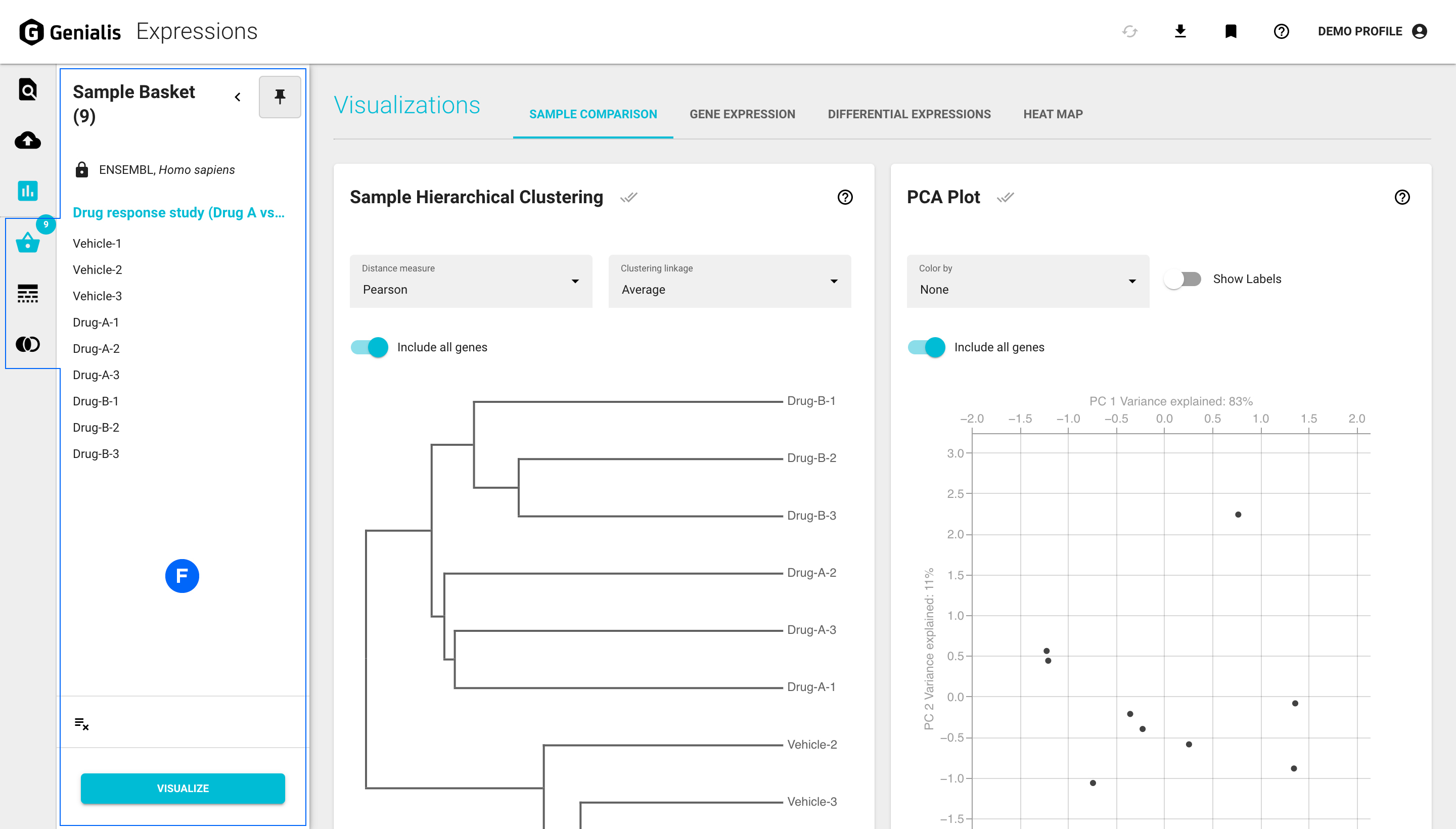
 The Visualizations page is where you can visualize and explore your data.
 The Import data page is where you import your data to Genialis Expressions.
D - Tabs
Content within pages is often organized in meaningful tabs. For example, the Visualizations page might contain tabs like: Sample Comparison, Gene Expression, Differential Expression and Heat Map.
E - Cards
A card represents the smallest unit of content on the app. This usually means that a card displays a single visualization e.g., Volcano Plot, a table, e.g. Differential Expression Comparison Table, or some other content/functionality, e.g. Import Data. Typically 2-5 cards per tab are displayed.
Sometimes a single card is used to display complex features. In that case the content is structured by using:
separate sections in an expandable/collapsable harmonica format or
tabs within the card.
F - Basket panels
The basket panels can be accessed below the page icons in the main navigation bar. A basket panel will open by clicking on a basket icon. By default the panel overlaps the existing screen content. An open panel can be collapsed back in order to maximize your screen space or pinned so that the panel is integrated next to the existing content on your screen rather than overlapping it.
There are three different basket panels available:
 The Sample Basket displays selected samples from the Search page or
a collection for further exploration in the Visualizations page. The number of samples
currently added to your Sample basket is indicated within the dot on the icon.
The Sample Basket displays selected samples from the Search page or
a collection for further exploration in the Visualizations page. The number of samples
currently added to your Sample basket is indicated within the dot on the icon.
 The Gene Basket displays genes of interest that you select while exploring
visualizations, e.g. selecting genes from the volcano plot, genes that you paste
into the basket from an outside source or genes from previously saved gene sets.
Genes displayed in the Gene Basket automatically populate all the relevant plots
within the Visualizations page. The number of genes currently added to your Gene
basket is indicated within the dot on the icon.
The Gene Basket displays genes of interest that you select while exploring
visualizations, e.g. selecting genes from the volcano plot, genes that you paste
into the basket from an outside source or genes from previously saved gene sets.
Genes displayed in the Gene Basket automatically populate all the relevant plots
within the Visualizations page. The number of genes currently added to your Gene
basket is indicated within the dot on the icon.
 The Gene Set Basket displays your saved gene sets or pre-uploaded gene
sets that are available to you. You can manage your gene sets within the Gene Set Basket,
as well as create Venn diagrams to explore your saved gene sets even further.
The Gene Set Basket displays your saved gene sets or pre-uploaded gene
sets that are available to you. You can manage your gene sets within the Gene Set Basket,
as well as create Venn diagrams to explore your saved gene sets even further.
Buttons
There are 2 main types of buttons used in Genialis Expressions:
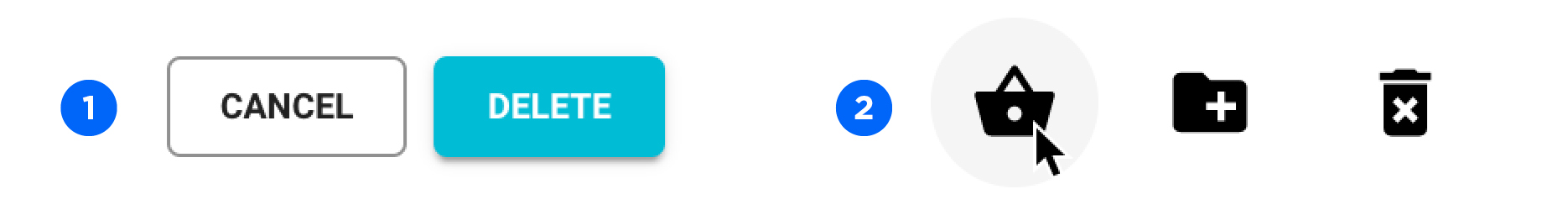
Regular buttons, which could be the blue primary buttons (used for the standard action) or the outlined secondary buttons (used for secondary actions or abandoning an action)
Icon buttons, usually used in tables or cards to access quick actions or features
Modal window
When an action triggered by clicking on a link, a button or an icon button requires an additional decision or a warning with a security confirmation step, a modal window will appear. It will darken and disable the main window and display the required dialog content in front of it. A modal window will close if you:
Perform the required step and confirm the actions by clicking on the main button
Click on the ‘CANCEL’ button to force the modal window to close without taking any action
Click anywhere outside of the modal window to force the modal window to close without taking any action

Other elements
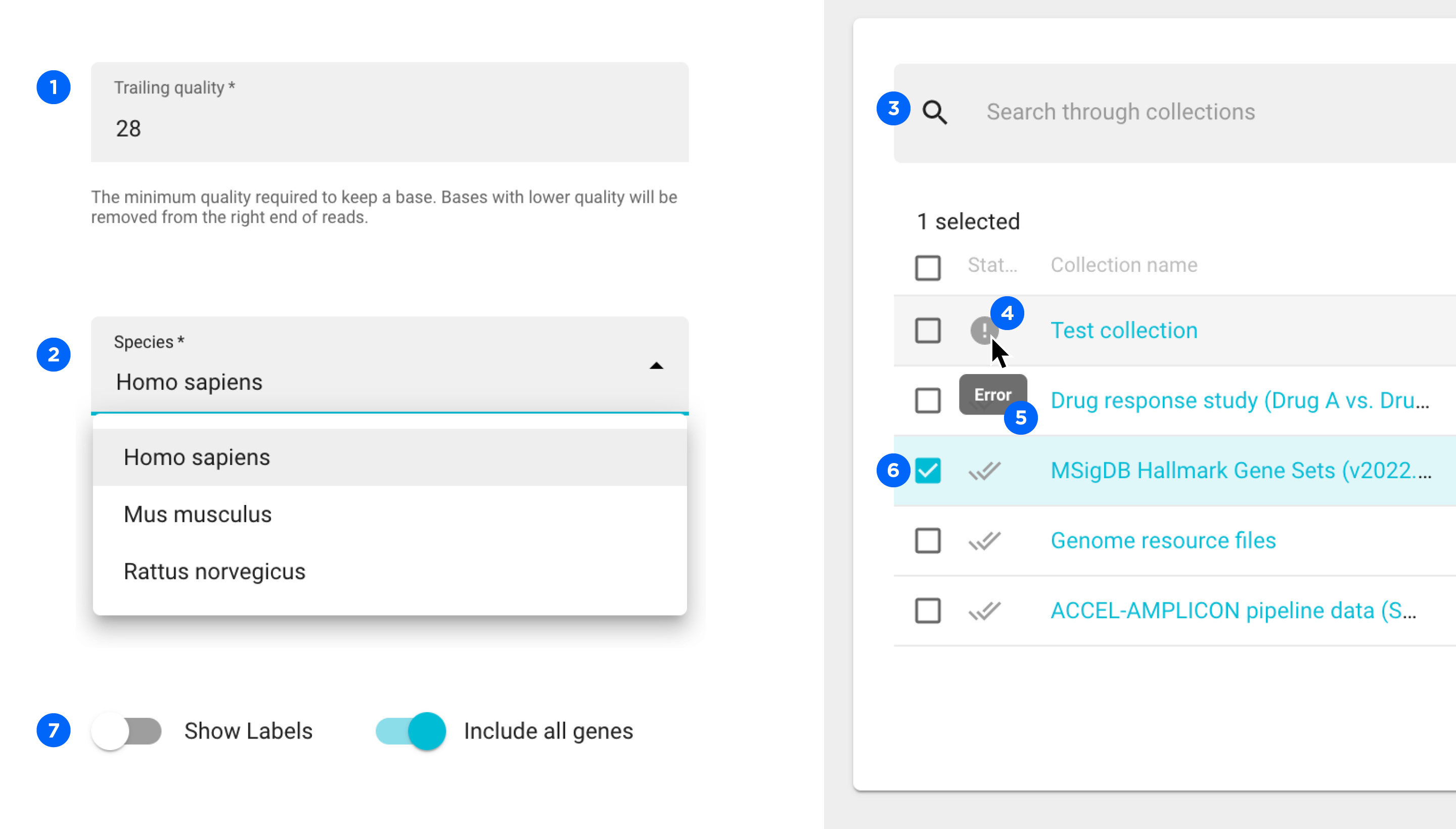
Input field - where you enter an information
Drop-down selection menu - where you select an option from a predefined list
Search bar - where you search for an object
Status icon - displays status information about a process
Tooltip - displays additional information about something by hovering with the cursor
Check box - where you select an object, usually in tables
Toggle - where you switch a feature on or off